Technical perspectives on accessibility implementation, including assistive technologies, UI interaction patterns, and emerging systems such as AI-driven interfaces.
Reading Time: 4minutesAn artistic collage of images depicts a refreshable braille user interacting with an android; behind it, a shadowy faceless character wearing a dark hoodie seems to manipulate the android.
Last summer, as I was finishing a graduate degree, I wrote a final paper on how the evolution of Artificial Intelligence (AI) could affect users with disabilities who use Assistive Technologies (AT) and how Cybercriminals can exploit AI shortcomings to target this demographic. Although my original paper is about Screen Readers, this could very well apply to any user relying on Assistive Technology to interact with digital products and services.
I found the AI/AT/Cybercrime intersection very interesting, so I decided to blog about it. For now, to keep the word count manageable, I will only outline my findings in this post and later write follow-up articles for each topic, which I will link here. I’m including the references at the end of this post because they are many, to avoid confusion with my own articles, and also to give full credit to source authors.
As of January 2024, legislation on Digital Accessibility is intensifying in North America [1, 2, 3] and Europe [4], imposing substantial fines for non-compliance. This article explores the intersection of AI, Digital Accessibility, and Cybersecurity, and how this intersection could affect visually impaired users with the evolution of AI-Agents replacing traditional User-Agents.
The Evolution of User-Agents into AI-Agents
AI is rapidly evolving, presenting both advancements and challenges, with user privacy and security at the forefront. AI-Agents, autonomous bots designed to perform tasks on behalf of users, are reshaping the digital landscape. Traditionally, Screen Reader software operates on top of User-Agents, such as web browsers, remaining undetectable by web analytics. However, the emergence of AI-Agents introduces new dynamics [5], raising concerns about user privacy and cybersecurity.
Privacy Concerns in the Digital Accessibility Landscape
In the realm of Digital Accessibility, the ethics of Assistive Technology detection have been debated extensively[6, 7]. Platform Design Principles emphasize the protection of user privacy for individuals with disabilities [8]. Detection of Assistive Technology poses a risk of unintended analytics discrimination and the potential disclosure of users’ disabilities without their consent.
AI’s Role in Enhancing Accessibility
On a positive note, AI has significantly improved Digital Accessibility for individuals with disabilities [9]. Tech companies leverage AI to automate functionalities, such as generating alternative text for images and facilitating voice chatbot interactions [10]. These efforts align with evolving accessibility regulations, aiming to create a more inclusive digital environment.
Cybersecurity Threats for Visually Impaired Users
Despite advancements in Digital Accessibility, visually impaired users remain vulnerable to cyber threats due to the lack of visual cues and limited software support [11]. Their top concerns include the theft of private information, malicious access to financial data, and the exposure of personal information. The rise of AI use in cybercrime further complicates this landscape, enabling more sophisticated attacks that are challenging to detect and combat [12].
Challenges in Differentiating Good Bots from Bad Bots
As AI-Agents become more prevalent, distinguishing between beneficial AI bots and malicious ones becomes a significant challenge. Ensuring the ethical use of AI-Agents, particularly in protecting user privacy and preventing fraudulent activities, becomes paramount.
Addressing Privacy Concerns in the AI Era
Most development companies are well aware of AI’s user privacy shortcomings [13], so they implement measures to make datasets private, reduce user identification possibilities, and eliminate edge cases from algorithms. However, users with disabilities usually fall into these edge cases that get eliminated [14]. Therefore, ensuring their inclusion and protection in the age of AI is imperative.
Balancing Opportunities and Challenges
Visually impaired users stand to benefit significantly from AI advancements, with AI-Agents automating tasks to enhance accessibility. However, the potential for cybercriminals to exploit users’ disabilities through digital interactions calls for a careful balance between opportunities and challenges [15]. For example, there could be times when users need to disclose their disability to interact with medical services, government agencies, obtain special discounts, or find special accommodations when booking hotel rooms, flights, or dinner. Right there and then, the AI-Agent will own sensitive information that could potentially be used to discriminate through analytics, or target users with disabilities for fraudulent purposes.
Conclusion
Innovators have to keep on their radar this intersection of AI, Digital Accessibility, and Cybersecurity; the crucial balance between harnessing AI’s opportunities and addressing the challenges it poses. Prioritizing user privacy, inclusivity, and safeguarding sensitive information despite the use of Assistive Technology. As we move into the future, continued research is essential to understand the implications of the transition from User-Agents to AI-Agents and its impact on visually impaired users, and those with disabilities in general. Striving for privacy equity in the age of AI is critical to prevent an internet divide and ensure a digital future that benefits everyone.
Reading Time: 3minutesPhotograph of a purple arrow pointing up, painted on a cracked concrete surface.
During a web development project, I had an exchange with intern developers who asked me if “back-to-top” buttons on web pages should be made keyboard accessible, based on an article they found on the internet, which seemed to support the decision not to make it accessible. Unfortunately, I can’t find that article anymore, so I’m writing this one as a reminder.
The argument was that this type of button is the last element on the page, and only one tab away to get keyboard-only users back to the top of the page anyway, so it seemed repetitive.
You may not have heard of scroll-to-top, or back-to-top, buttons before, but if you are a web developer or a UI/UX professional you most likely have, and then you may think these kinds of buttons are petty or irrelevant. But if your website or app is scheduled for an Accessibility Audit, then they are relevant.
To me, it seemed obvious that it had to be accessible regardless of being repetitive. My concerns about not making it accessible are audits and legal aspects. But the interns did have a valid point supported by the argument in their referred article. So, I was curious to find out at least two things from my IAAP peers:
1. If somebody had come across this topic during an accessibility audit, and how they solved it.
2. If it could be perceived as discriminatory: to have the button available for some users and not for others.
I reached out to expert colleagues on the IAAPForums. After posting my concerns and starting a thread, two experts got back to me.
Expert #1 said that although it could be perceived as a failure of WCAG Success Criteria 2.1.1, it may not necessarily have to be, as long as the page’s functionality is operable with a keyboard. He went on to explain that “as long as there is a way to perform that function, namely, to move the focus to the top of the page using the keyboard, then the button itself doesn’t necessarily have to be keyboard accessible.”
However, he warns that while some keyboard shortcuts, such as Home or CTRL+Home, do scroll the page back to the top; they don’t move the focus to the top. So, if the purpose of the back-to-top button is to get the focus back to the top, then in that case, “the functionality of the ‘back-to-top’ button isn’t available to me” from a keyboard-only user perspective.
“I always encourage you to make every clickable thing on the page keyboard focusable, even if you don’t think anyone needs it. But since you aren’t everyone, it might be hard to picture who might need that feature. For the person that needs it, they’ll be very happy you have it.”
Expert #2 echoed the WCAG failure aspect, saying that “not making it accessible would be a violation of keyboard-related accessibility standards,” which is audit relevant, but also highlighted that not making it accessible is the effect of a conscious choice, clarifying that “actively not making a button accessible when the default is to do so can be construed as an intentional discriminatory act.”
Expert #2 wrapped up by saying, “In general, making a button accessible is pretty trivial when done with the initial development.” Which made perfect sense, so I got back to the interns with that feedback, and we concluded the issue was very simple to fix and not worth leaving to chance.
Reading Time: 3minutesA man holding a credit card while typing on a laptop.
If you are the owner of an online storefront in Canada, you should get familiar with Screen Reader software and start listening to your website. In August 2022, the Retail Council of Canada published the Accessibility Amid a Changing Retail Landscape Guidebook to provide Canadian retailers with quick tips on how to interact with customers with disabilities. Out of its 28 pages, 18 emphasize in-person interactions, and only five pages are about online interactions, mostly WCAG references.
Making online stores accessible has become a trend in Canada. The Government of Ontario is targeting the creation of an accessible province by 2025 through the Accessibility for Ontarians with Disabilities Act (AODA). Other provinces are following along and the Federal Government has also started moving toward federal regulation by creating technical committees. The consequences of non-compliance for the Web Accessibility part are still unknown, but if we look at how it’s going in the US with the ADA, there are some reasons for concern.
I will not get into details about WCAG (the technical standard) because it’s where people stop reading and start stressing. Rather I will try to convey what the expectation is for an accessible online storefront. In my experience as a Certified Professional in Web Accessibility, I recommend starting with making Screen Readers work well on storefronts, instead of starting with colour contrast and font size.
There is a layer on every User Interface (UI) that “speaks” to the user, literally. If it doesn’t, then something is wrong. In this context: silence is bad. If you test your storefront with a Screen Reader and don’t hear anything, or the vocalization doesn’t match the part of the page you are on, most likely your storefront is not accessible, therefore not compliant.
Web Accessibility is hard to implement because it’s hard to empathize with what the User Experience (UX) should “look like” for people with disabilities. In my experience, once it’s understood that we must aim instead for what it should “sounds like”, then we will be closer to fixing the problem from the ground up. Think of it as a person telling you over the phone what they are doing while shopping at a supermarket. This “listening experience” should match the user’s interactions.
Nowadays, most people know what wheelchair ramps are for in supermarkets. Most shoppers, handicapped or not, find it useful to push that big button to automatically open the doors. Audio jacks have been available in ATMs for over 20 years. All the previous allow consumers with disabilities to exercise their full shopping potential in the physical world. It doesn’t have to be any different for online shopping.
Also, there isn’t any lack of examples of what an accessible UX sounds like, we just need to know where to look. For instance, if we keep in mind that Government Organizations should be compliant with Web Accessibility as well, my first reaction would be to take a look at how “Retail by Government” is being implemented, so the online storefront of the Liquor Control Board of Ontario (LCBO) would be my first stop in finding out.
I’m not saying you should follow LCBO’s UX “by the numbers”, but listening to its vocalization while browsing it with a Screen Reader, will give you a better idea of what the goal is.
If you manage to make your online storefront vocalize accurately, the rest of the accessibility bugs are discoverable with automated testing and fixes are easy. Yes, you still need developers and accessibility experts, and no, widgets and overlays will not provide compliance.
Reading Time: 4minutesAn ear coming out through a hole on a white sheet of paper (listening to component interaction is key to improving Screen Reader UX).
This is a non-comprehensive list of recommendations on how to improve the Screen Reader User Experience (UX). This list has worked for me in the past to get consistent results between planning and deployment. This article is mostly addressed to developers, visual and interaction designers, and QA testers. Not all recommendations apply to every role, but all outcomes are helpful for everyone. Other project stakeholders, like Project Managers, can benefit from knowing these recommendations. This is not a formal checklist but it can be the foundation for one.
There is a layer under every User Interface (UI) that “speaks” to the users. And I mean literally speaks to them. If it doesn’t, then something is wrong with the UI. Most of the time, individuals unfamiliar with Web Accessibility don’t realize this.
Same as we usually test by visually browsing and testing with the mouse. Performing tests with keyboard-only navigation and Screen Readers are becoming a requirement. To hear what components and their interaction sound like. Needless to say: silence is bad.
There is no replacement for hands-on manual in-person Screen Reader testing. To the writing of this article, there isn’t any automatic test for Screen Readers. Testing the Screen Reader UX from conception to implementation is one way to improve it.
General Improvements to Screen Reader UX
Define user journeys for every UI or page. Write it down as a numbered list. E.g., “User Tabs to component A, then uses the down-arrow key to reach element A1, …”.
Video record screen reader sessions based on defined user journeys. Make sure to enable “computer audio recording”, otherwise it will result in a video without audio. Video recordings are a great reference when explaining to a developer how to reproduce screen reader bugs.
Test in as many different screen readers as possible. Some are free, some are pricy, some are strict, and some are very forgiving.
Test accessible gestures for mobile devices, but also small devices with external keyboards. E.g., Android Tablets with external mini keyboards.
Beware of cross-screen-reader bugs and aim towards cross-screen-reader solutions. E.g., VoiceOver for Mac will vocalize just about everything, including dynamic content. As opposed to JAWS/NVDA for Windows, which may need a preloaded parent tag for similar results. That is to say, vocalization varies from one Screen Reader to the next, depending on implementation, platform, and devices.
Be patient while testing ARIA attributes. Testing vocalization will take much longer (even at expert levels) than the usual “Mouse + Browser” testing. This is normal, adjust expectations and time estimates.
Make sure to test for consistency and double-check screen reader vocalization across different environments. E.g., localhost, development, staging, live.
Video record experimental approaches to improve Screen Reader UX that didn’t make it to the final implementation. Save for future recycling.
Video record the approved “final” outcome to avoid and spot regressions.
Improving Screen Reader UX by Role
As a Designer, explore examples and references using a screen reader (desktop and mobile). Listen to what components and elements sound like. Video record the screen reader exploration sessions to show to developers and other stakeholders. Point out cross-screen-reader vocalization differences as soon as spotted; they tend to be forgotten.
As a Developer, test with a Screen Reader while developing. If designers provided a video recorded session of the expectations, try to aim for a similar result (desktop and mobile).
As a QA tester, add video recordings of screen reader bug detections to QA tickets (desktop and mobile). This will help developers reproduce and debug issues faster than reading text and interpreting the instructions on how to reproduce. It saves on explanations about how to reproduce and issue.
As a stakeholder, be aware of cross-screen-reader differences and limitations.
What to Avoid
Avoid using Chrome extension to replace or emulate Screen Readers software. The only focus of emulation should be to emulate the user, not the software. As of the writing of this article, I haven’t come across an extension that emulates some ARIA scenarios. Such as aria-expanded, or aria-live which already have some cross-screen-reader issues when using real software, so avoid emulators.
Avoid turning off the screen reader when it starts vocalizing. Instead, listen to it speaking, and try to associate the speech with the UI component and the interaction. I have to admit this happened to me at the beginning. Then I realized THIS is exactly what I should be testing: vocalization. Last year I wrote an article about overcoming the uneasiness of screen reader testing. It’s a helpful guide for slowly adapting to that new environment.
Avoid browsing the UI with the mouse while using a screen reader. This prevents hearing some additional instructions the Screen Reader might be vocalizing by default. E.g., specific keyboard key combination to interact with the component. Don’t skip components or elements with the mouse, always use keyboard-only navigation.
Avoid including ARIA attributes without actually testing them with a Screen Reader and listening to how they sound.
Avoid listening to music while testing with screen readers. Some developers and designers like to hear music or watch videos while working. Honestly, so do I, but then suddenly hearing the computer speaking might be distracting. This could make a slow process even slower.
Reading Time: 5minutesZoomed-in photograph of a computer volume indicator set to a low volume.
I remember the first reaction I had when I started to work on a Web Accessibility project and did Screen Reader testing. So I turned on the Screen Reader for the first time, then I wanted to shut it down immediately. I got confused between what my eyes were reading and what my ears were hearing. Concentrating on both areas at the same time, the visual and the audio, was hard. Got worst when the Screen Reader was narrating and I was trying to speak, while screen sharing and presenting something.
A word for newcomers
It’s been a while since that, and I’m well adapted now. But that same reaction I had, I keep finding it whenever I have to coach newcomers to Web Accessibility. When explaining how to optimize, code, and then do Screen Reader testing to confirm vocalization. That perceivable embarrassment, when they can’t turn off the Screen Reader. So, I’m writing this article to quickly share a link with newcomers. What you feel is normal, and you will adapt the more you use it, but don’t turn it off. It’s like the first time using Windows coming from Mac, or vice-versa. Or switching from a native language to a new language. It feels like your brain stretches.
So, how do I turn it off, they ask? The answer is, “let it speak, that’s the whole point of Screen Reader testing”. Listening to the spoken representation of the User Interface, and then verifying if it’s equivalent to the visual experience. Emulating the listening experience, as Screen Reader users would experience it. Empathizing to emulate users is hard, it’s a process, and adaptation takes time, but it’s worth it. Then, patience and practice.
First Aid Kit
If you are seriously overwhelmed by the Screen Reader narration to the point where you just can’t focus on what you are doing. Then you could use the following tricks butdon’t turn off the Screen Reader:
Press the Control key to pause it, works for all Screen Readers.
Turn down the volume and enable Speech Viewer for NVDA, comes free and can be enabled under “Tools” in the NVDA menu.
There is also JAWS Inspect for JAWS, which unfortunately has a cost.
If you are testing in VoiceOver for Mac, then you may already have seen the text output, so just turn down the volume.
Update on 11-22-2021, more aid tricks:
You could turn off the Speech Mode for NVDA. There are three Speech Mode settings so you can press Ins + S three times to cycle through them all.
On Windows 10, you could turn down the volume for just JAWS/NVDA with the “Sound and Volume Mixer” by right-clicking on the speaker icon on the system tray. Then select “Open Volume Mixer” to open it. Here you can change the volume for individual applications.
Uneasiness towards Web Accessibility
Sometimes I have also noticed that talking about Accessibility is uncomfortable for newcomers. Especially the user emulation part, it triggers different emotions ranging from fear to disdain. Going from “It’s scary to think about this, I don’t want to attract this”. Or “I can’t emulate because this will not happen to me, I don’t see myself there”. Well, on that, I guess it depends on the different authors we all read and our different points of view. Yet, Accessibility needs to be implemented, regardless. So, how do we break through this discomfort too?
Well, we have to be aware that, by avoiding or postponing Web Accessibility, either by omission or deliberately, we are discriminating against users with disabilities by preventing access to content or transactions. I know it’s a strong word, but that’s exactly what it is. In some jurisdictions, lawsuits would follow. Think of the users who can only use software with Screen Readers. They can’t turn it off.
Overcoming uneasiness
Last year I read author Brené Brown. In her book “Dare to Lead” she says discrimination comes as a result of shame. She proposes as an antidote for shame: Empathy and self-care. Understanding what triggers shame reduces its power, she says. I couldn’t agree more. It really sounds easy once placed in perspective. However, empathy is a process (it needs context, unlike sympathy). Self-care requires enough awareness for introspection, as well as a strong willpower.
So, it’s not easy to get to the antidote, although the effort is worth it. Nonetheless, sympathy is easy, because it doesn’t really require the context of “walking a mile in someone else’s shoes”. There, where we first need to learn how to tie those shoes, and the walking cadence. But sympathy is about caring and understanding.
Having said that, while working on the larger and well worth goal of removing shame, without being shameless. It should be sufficient to just be bold enough to have sympathy (caring). Understanding the fact that, we may be depriving users with disabilities of opportunities most users give for granted, and that is illegal in some places. It’s important to remember as well, that disabilities are something that can happen to anybody at any time in their lives. Accidents do happen to those born without disabilities, regardless of favourite authors or philosophical alignments. Also, most people in most cases, already know someone who was born with a disability.
Working in Web Accessibility projects gives the implementors a new perspective. Prepares them if a disability ever catches up with them, or puts them in a better position to help someone they know who was born with a disability. We implement Accessibility to empower users. Implementors are also users.
Empowering users with disabilities
While overcoming the uneasiness of the Screen Reader testing new surroundings, I suggest we always remember famous people with disabilities. Like Hellen Keller or Louis Braille. Back in their days, they were able to create systems to help, empower and inspire other people with disabilities. Shouldn’t it be easier now with the help of technology and the information we have at hand these days?
Brilliant minds like that of Stephen Hawking reached their highest point and popularity because they were empowered by the technology of their time, and by the people behind that technology.
As professionals involved in projects where Web Accessibility is implemented, we must focus on empowering users with the solutions we create in our daily work. Focus on making software everybody can use, just as intended for the physical world. If we plan for wheelchair ramps and automatic doors. Why not make sure keyboard navigation is provided as the first layer of Web Accessibility.
In his book “Outliers”, Malcolm Gladwell presents a series of interesting facts about successful people. We want to be successful as Web Accessibility implementors, don’t we? Gladwell writes about how they became “outliers”, and how the same formula can be applied to anybody, consisting mainly of 3 elements:
10,000-Hour Rule: Practicing a skill for 10,000 hrs.
Generational opportunity: being there while key events are happening.
Help from others: People that will propel those skills into action.
So, this is the best time in a generation to start empowering people with disabilities by means of technology, it’s a key event. Their perspective, and their unique circumstances, will provide humanity with contributions that wouldn’t be possible otherwise. We, as implementors, must use our talents and skills to propel theirs. And yes, it takes time.
Reading Time: 8minutesAn artistic illustration shows a collage of images. A woman wearing a yellow scarf and a black jacket with a watermarked web accessibility logo. A male blind user over a keyboard background. A hand with a bandage cast. A dollar sign connects all 3 images.
The Accessibility Dilemma
Success criteria for web accessibility under WCAG 2.0 (Web Content Accessibility Guidelines) could be overwhelming if seen only from the textbook perspective. In my experience developers and managers have almost unanimous discomfort reactions to Web Accessibility projects. Such as: do we have to read “all that”, it’s just “so boring”, “just run the validator” … crickets and tumbleweeds to sum it up.
As a developer and learner of Web Accessibility, I realized that once moving past the “excruciating pain” of reading the criteria then it can be approached from different angles. From the User Experience angle for instance, and also by layers. Slowly, but really, by just testing it. Something developers do all the time. Now, that usually gets me into the following Q&A:
But, what do we need to “test” exactly?
What we unconsciously do most of the time: the user journey.
How do we do that?
By consciously empathizing with the disabilities our users may have, in other words, simulate or emulate.
Isn’t it enough to test my site with a validator?
It’s not. Validators are of great assistance when analyzing large websites for some criteria. Like 20% of them only. However, I have seen validators passing sites with flying colours only to realize they are, in fact, not accessible hands-on.
Concrete analogy, please?
Believing that just because you comply with a few criteria, makes your website “accessible” to a certain level. Would be like thinking your office building is “accessible” because it has a very big button to open the door automatically at the main entrance … but only after passing through a gravel parking lot and climbing a staircase. So how does the user make it to the door for starters?
Storefront Accessibility
Many sectors are subject to Web Accessibility compliance these days, for some —like government— is mandatory. Online retail has become the target of a growing number of lawsuits, also users with disabilities have clear expectations, therefore a growing need for Storefront Accessibility is on the rise. Sometimes making the difference between a “lead-to-cash” approach to a “lead-to-lawsuit” outcome.
Premises
Let’s illustrate the process with an example, but first establish some premises:
The main goal of a storefront is to allow users to checkout products.
Elements on the interface should facilitate the user to complete checkout, including users with disabilities.
Developers and Quality Assurance Testers often test by pretending a user can successfully get from point A to B or Z on the interface. The same folks should also test that users with disabilities are able to get to the same points.
Successfully getting from point A to B or Z in a test, while emulating a Persona with disabilities, will result in a number of successfully complied accessibility criteria.
About Empathy
Before getting into what a Persona is, let’s clarify empathy. It sounds like something easy to do, we’ve heard it many times: “put ourselves in somebody else’s shoes”, how hard could it be? Well, turns out people have different levels of empathy and are usually influenced by their own life experiences… so it’s not that easy.
Sympathy is NOT Empathy
Also, different perceptions of what empathy means complicate things, I’ve heard many spontaneous definitions: it’s about having a big heart, being all sentimental about something, being a philanthropist, or reading emotions “between the lines”… yes, I guess it could very well be all that depending on the context of the conversation, but still, all the aforementioned are closer to sympathy than empathy. Now, when talking about Web Accessibility, empathy is luckily a very pragmatic issue. For example, an online storefront is either accessible or isn’t. In other words, “half accessible” doesn’t do if a critical journey is not successful. As it wouldn’t do for a brick-and-mortar store. Either shoppers with disabilities can or cannot go in and shop.
Regardless of how one “feels” about the fact, our good intentions, thoughts and emotions poured into thinking about the users who are unable to use the storefront won’t make it more accessible. That’s sympathy. It’s nice. It’s motivation. It helps. It raises awareness. But it doesn’t make websites accessible.
My usual story to “induce” people into empathy is as follows, let’s add a relaxed atmosphere first and pretend we are in a restaurant or a bar, surrounded by family, friends or occasional bystanders, usually the context where I tell this story:
Pretend you (a user without disabilities) are shopping online for a simple product, such as let’s say… a yellow scarf for women, and suddenly your computer mouse stops working —its battery runs out— and you have to finish the checkout using only the keyboard.
Resistance to Empathy
Of course, there is always resistance to this empathy exercise, and it’s normal, we are placed out of our comfort zone. So I hear things like: “what if I’m using a laptop that has a built-in mousepad” … let’s agree that’s not the point. It may sound like nonsense having to empathize in something as banal as having a mouse, but it’s relevant to the full process.
I have to point out a generational factor in these casual audiences of my stories; let’s keep in mind that users that owned a computer in the mid-80s may recall how to move on the screen with a keyboard, back then ball mice were only starting to be introduced and it wasn’t until the late 90s that optical mice became commercially available, but users that were born in those decades may be caught off guard envisioning a keyboard-only scenario. As I said, not so easy to empathize with.
Anyway, once the example is assimilated and people start throwing theories and remembering or figuring out how to move on the screen using only the keyboard, then we will have an idea, a plan, a roadmap —a journey— on how to finish the checkout.
Ok, once this keyboard journey is assimilated, let’s add complexity: Let’s pretend you have purchased this item many times (get yellow scarves for everyone) and now you know the process by heart, know it “so good” you can do it without a mouse, so good you can do it “with your eyes closed” … really? … let’s try that: keyboard navigation + eyes closed.
Personas with Disabilities
Before closing your eyes, let’s define what a Persona is; In the context of User Experience (UX) Design, “personas” are archetypical users whose goals and characteristics represent the needs and limitations of a larger group of users. Yes, putting faces to users helps with the empathy process, by googling “personas for accessibility” we can find many readily available personas to use, but then yes, more reading … crickets and tumbleweeds again.
That said, to follow up on the casual oversimplified storytelling at the bar, and since this article is starting to get long (missing the point on not having to read that much) let’s just oversimplify in a short paragraph a couple of personas that can be easily emulated by users without disabilities. Enter Jane & John, coming from a previous article, they have helped me before when setting accessibility foundation perspectives, and expectations.
Jane: right-handed user, who recently broke her right hand, has to use keyboard-only navigation, relies on her sight to know where she’s at on the screen, and for getting to the next element in a User Interface.
John: blind user, uses keyboard-only navigation, relies on a screen reader vocalization to know where he’s at, and to get to the next element in a User Interface.
The tale of a yellow scarf
There are many ways a user can navigate a storefront, but there are always paths that are more common, those where the storefront actually makes money are the critical user journeys. Keyboard-only navigation is no exception to this, so let’s agree on an average super simple journey based on the product from a story on Storefront Accessibility, a yellow scarf for women.
Critical User Journey
Test use case:Jane is looking to buy a yellow scarf for herself. On the other hand, John wants to buy the same scarf for her girlfriend. To further clarify, Jane & John, are not related, not they know each other.
For both, Jane & John, the critical journey to buy a yellow scarf for women will look something like this:
Tab to Search field > type “Yellow scarf women” > Tab to the first product (pretending is the yellow scarf) > Start the checkout process.
Emulate or Simulate?
We’re getting there, thanks for reading this far. The difference between simulation and emulation is subtle. Since they both include the word “imitation” let’s stick to that concept. For the following example, we are going to be using emulation software, so let’s call it emulation, but know that I definitely mean imitation.
Now, Imitation is key to empathizing, and we need to do that as close as possible to how Jane & John will navigate to that yellow scarf in a storefront. We know both will be using keyboard-only navigation, so that leaves us with the following keys to complete the checkout.
Keyboard Interactions
TAB
SHIFT+TAB
SPACE
ENTER
Arrow keys.
Additionally, John will need a Screen Reader, a stand-alone software with many features. Also with an important learning curve. Luckily we can emulate the basics of this technology by installing the ChromeVox extension in your Chrome Browser to emulate a Screen Reader. It has to be said that, no extension to this date, has as many features as a full-fledge Screen Reader software, such as JAWS, NVDA or VoiceOver.
Ok, this is where I dare the bar’s audience and you, the reader —just kidding— I kindly invite you to choose any, or several, online storefronts out there on the web. But most importantly, one where you can find a yellow scarf for women and try to go as far as you can through the checkout process by emulating Jane & John. That said, you don’t “actually” have to buy the scarf every time, not if you don’t want to.
Emulating Jane
Follow the critical user journey using only the keyboard keys Jane would use.
Emulating John
Activate the ChromeVox extension and —finally!— do close your eyes, and then follow the critical user journey by listening to what the vocalization tells you, and by using only the keyboard keys John would use.
Common issues
As you compare your emulation experience throughout different sorts of storefront accessibility, you may run into issues such as: being unable to tab to the next logical element in the page by landing on random elements, unable to tab from any point forward (keyboard trap), unable to hear a meaningful description of the product, like its colour or its price. Sadly, this is very common and an indicator of the lack of Web Accessibility on a particular website.
Criterion compliance
Clarification of terms: criteria is plural; criterion is singular.
Now, if you have managed to successfully finish the checkout process by emulating Jane & John, then that storefront has complied with the following WCAG 2.0 criteria.
Table showing 16 criteria for the Successful emulation of Jane and John. The first 6 criteria are for Jane and John, the remaining 10 only for John)
Notice how most of the criteria are Level A with only a couple of Level AA. In my opinion, those above are the most important criteria to comply with “for starters”. They set the foundation for building a richer user experience on top of them. For example, adding more Level AA criteria, or plugging other assistive technologies like braille displays. Let’s consider them the hard part, or independent from “simpler” criteria, like those regarding the use of colour, text size, video and audio.
Well, this is where the story at the bar ends. Either if you were able or not to finish the emulation as Jane & John. Even if you just tried a little, it deserves a toast. As you may have realized by now, by closing your eyes you began to “see” where the problems are with Storefront Accessibility. So, cheers to that! with whatever you are drinking.
In Conclusion
We can validate Storefront Accessibility by “walking the walk” with empathy.
When planning, developing and testing an online storefront, any effort in the process to remove bugs related to the 16 criteria stated above will facilitate the checkout for users with disabilities.
A web developer should make sure an accessible critical user journey actually works before handing it over to the QA tester.
The best validation tool is empathy.
Sometimes by closing our eyes, we can “see” where the problem is.
Shoppers with disabilities should be able to purchase online as they do in brick-and-mortar stores.
Nobody is exempt from disabilities through a lifetime, best case scenario: we all age.
Web Accessibility should be seen as a business opportunity in any lead-to-cash strategy before it becomes a lead-to-lawsuit scenario.
Reading Time: 5minutesArtistic illustration showing a web accessibility logo trapped in a mesh fence.
CSS Grid could create accessibility issues if not used with prudence. It gives great power over the User Interface (UI) layout. But if we lose touch with the source order, then the User Experience (UX) could end up not making sense for users either with or without disabilities.
Web accessibility awareness is growing due to its costly consequences if omitted. More and more unwary retailers or content providers exclude their clients and users by overlooking their disabilities. This growing trend is becoming close to an act of discrimination. Besides the liability side, organizations could be missing out on revenue, audience and human resources by this omission.
As a UI Developer, part of my work is to test new layout implementation approaches for web applications. Always keeping in mind the needs of our clients and their users. With the clear mission of providing a comparable UX journey for users with and without disabilities.
Comparable UX
Providing a comparable UX is not easy, it’s a challenge to balance visual order vs source order. The visual order is that in which the elements of a page are being visually rendered on the screen. However, it may not necessarily correspond to the source order. Being the one in which those same elements appear in the code. Visual perception is two-dimensional and non-linear; the desired visual order is not always equivalent to the desired reading order.
Keyboard-only users could navigate (tab) their way through page elements. Then finding themselves jumping from top to bottom of the page due to a reordered element being next in line in the source order. This gets worse if for some reason the tab order is altered with “tabindex”. Then pointing towards elements in a specific order when implementing group skipping.
This could grow in complexity when adding breaking points. When elements get reordered for many screen sizes. Mobile assistive technologies like VoiceOver for iPhone (gesture-based screen reader) offer multiple ways to navigate a page. Either by headings, by links or by landmarks among other options.
Visual order vs. Source Order
Disconnection between visual order and source order is not a new topic. It was already spotted with the “position: absolute” declaration a decade ago. Same for Flexbox and now CSS grid. Although this is a known issue, unsurprisingly there isn’t enough awareness about this matter. It is onlywhen targeting Web Accessibility that this actually becomes “an issue”. Especially because source-order independence is a wanted feature in CSS-grid.
So, this article aims at bringing more awareness by spreading the word on the Accessibility Interference issue. It is mainly aimed at Web Designers, UX Designers, Frontend/UI Developers and Product Owners. If you are looking for answers and suggestions on how deep to implement CSS grid. Or if it’s worth implementing it at all (having Web Accessibility as target).
Quick reminder: CSS grid does not replace Flexbox, they work on different dimensions. CSS grid is for ordering items in two dimensions: rows AND columns, whereas Flexbox is single-axis oriented: either rows OR columns.
Illustration showing axis orientations for CSS Grid and Flexbox
That said, it’s clear we need to resist the temptation of using CSS grid for placing just about everything on a page only because it’s possible… but let’s do that anyway for demo purposes. Let’s pretend we’re building an e-commerce storefront with CSS grid and we totally overlooked Web Accessibility.
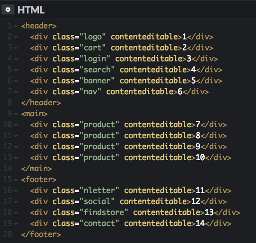
Source order matters
For the purpose of this demonstration, let’s oversimplify the source code to the most basic elements of a generic storefront, and add “contenteditable” attributes to make all <div> focusable:
Image shows original and well-organized source code order for the CodePen example
Now let’s also pretend the design has had many revisions. That’s how the code ultimately ended up in the above order. Because developers told designers: “Ok, go crazy folks! Devs can reorder it, we have CSS grid powers” (not that this happens in real life). So, we get this visual order:
Animated GIF shows how CSS grid visually changes the order of the elements and its tabbing order
The above is nowhere near close to the source order. For users without disabilities, there’s nothing wrong with this picture since everything is a mouse-click away, no big deal. But now let’s empathize with a couple of UX personas with disabilities to see how they experience the user journey.
John: blind user, uses keyboard-only navigation. He relies on a screen reader vocalization to know where he’s at, and to get to the next element in a UI. For John, reaching the search bar, navigation and product has priority. Let’s not forget he can’t see which element comes next. This is a storefront, so let’s not delay him from checking out the product he’s looking for.
Jane: right-handed user. Recently broke her right arm. Has to use keyboard-only navigation. Relies on her sight to know where she’s at, and for getting to the next element in a UI. Although Jane’s disability is temporary, and she can see which element comes next… oh wait! not quite. For her, all this jumping around the page is very annoying. She gives up and heads to the competitor’s storefront.
In conclusion
If you must use CSS grid in a project that targets Web Accessibility. My first suggestion would be to follow Inclusive Design Principles while designing the UX, the UI and while coding it. This will help reduce visual versus logical reordering scenarios. It’s important to realize your UX personas different situations and their context.
Other suggestions to improve Web Accessibility
Start with a structured and accessible document, something that makes sense even without CSS.
Spot key elements that, when vocalized with a Screen Reader, make sense to the user journey.
Avoid reordering the visual order of the aforementioned key elements.
Limit the use of CSS grid to layout the structural areas (ex. header, aside, footer, main, etc.).
Avoid using CSS grid inside the structural areas to reorder elements within (like in the demo), but if you really must do this, check for Accessibility at every step. Revisit the Inclusive Design Principles, cases vary, but chances are more empathy is needed.
Always come back to the source and check if the order still makes sense when aligned with the visual order.
Beginning and finishing with a well-structured document is the best way to start achieving Web Accessibility. Remember text in the document is the spoken representation of the website. Meaning, the order in which the elements on the UI will be vocalized. By screen reader software, and most likely by any other assistive technology. The un-styled document should always make sense when read by humans and by assistive technologies.
I know, wouldn’t it be great if browsers had a way of figuring out and following the visual order in a page instead of the source order? #Futurism?